Identity design for a Melbourne hospitality and culture collective.
CATEGORY:
AGENCY:
YEAR:
2024
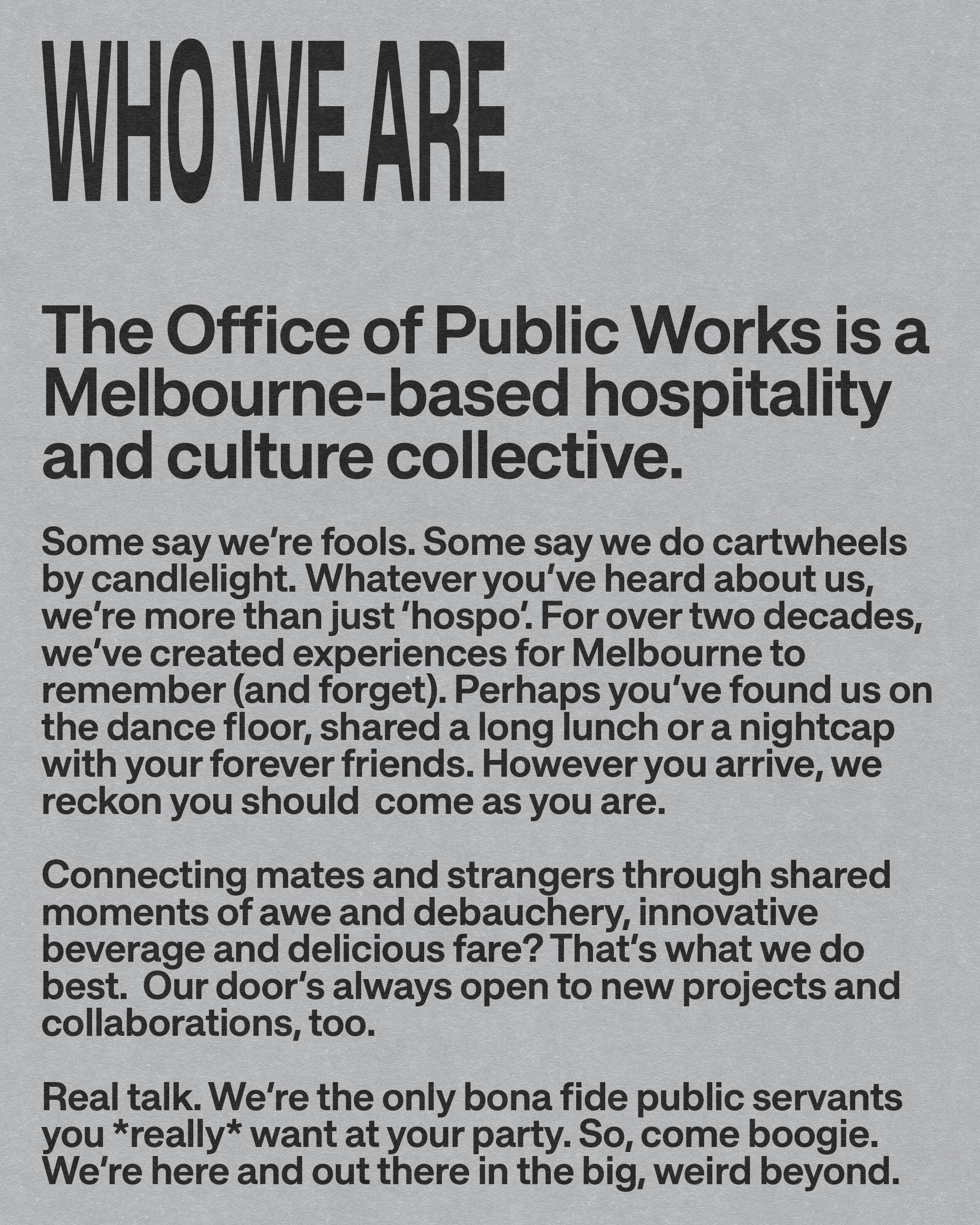
The Office of Public Works is the collective behind Australian hospitality baron Maz Salt and a number of Melbourne's best-known hospitality projects. Since launching the OG laneway bar Section 8 in 2006, the group's been behind venues like Ferdydurke, Belleville, Globe Alley, Radar, The Beast, Beast City and more. All spaces that have been seminal grounds driving grassroots movements across culture, style, music and art. Coming into 2024, 'OOPW' didn't have a cohesive identity that captured the group's energy, purpose and people within. Something to attract investors, artists and collaborators. Something to represent the diverse spread of sub-cultures the spaces nurture. Something to make the group distinct from other hospitality groups. The projects themselves don't follow a set playbook. They're organic. Non-prescriptive. Non-assuming. Low-fi. All filled with patchwork quilts of personalities and characters. Big pirate ship energy. Trends aren't followed, it's radicalism over conformity. A frothy brew of ideas and influence to begin crafting an identity.
CHALLENGE
APPROACH
No items found.
No items found.
Outcome
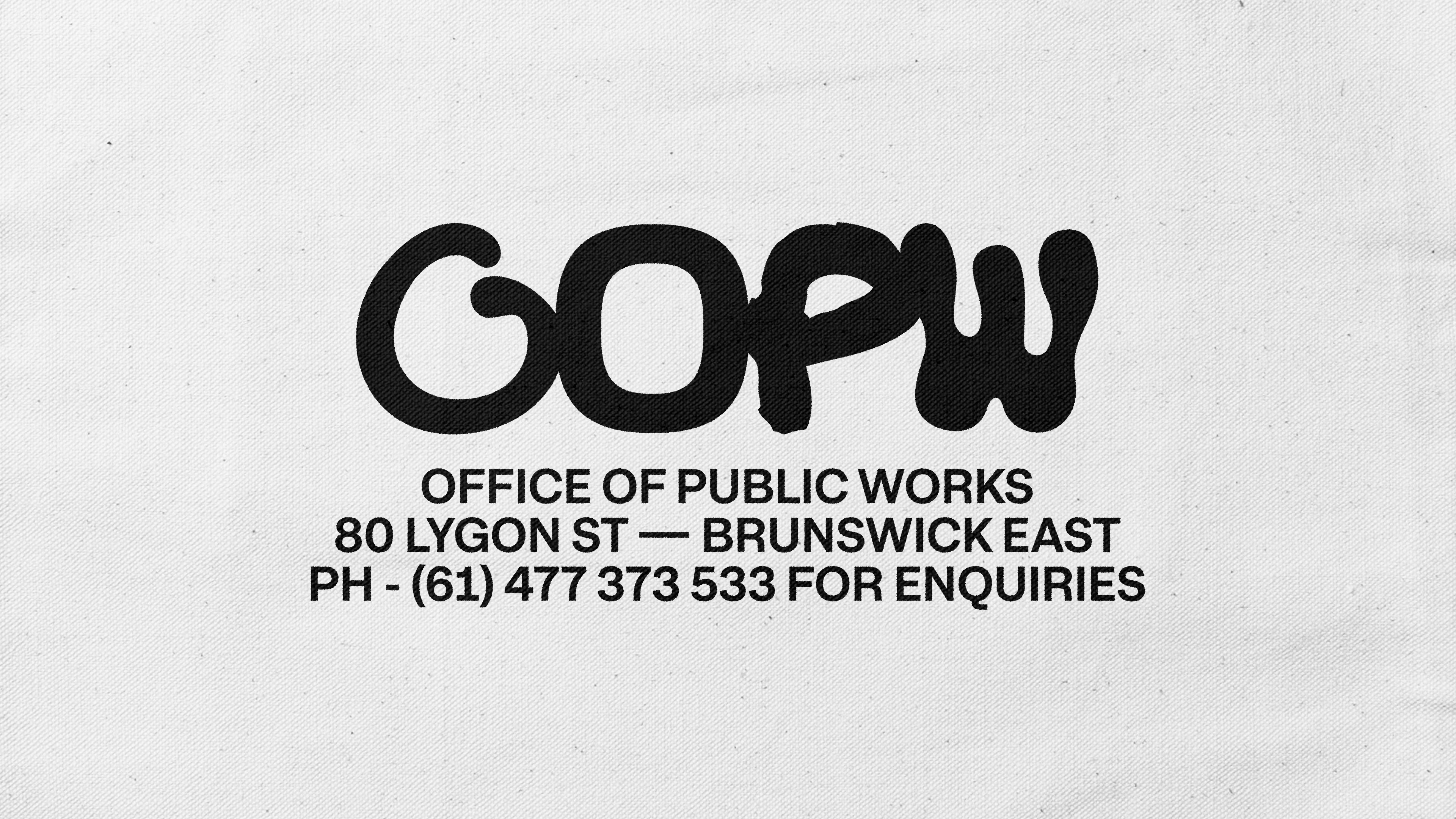
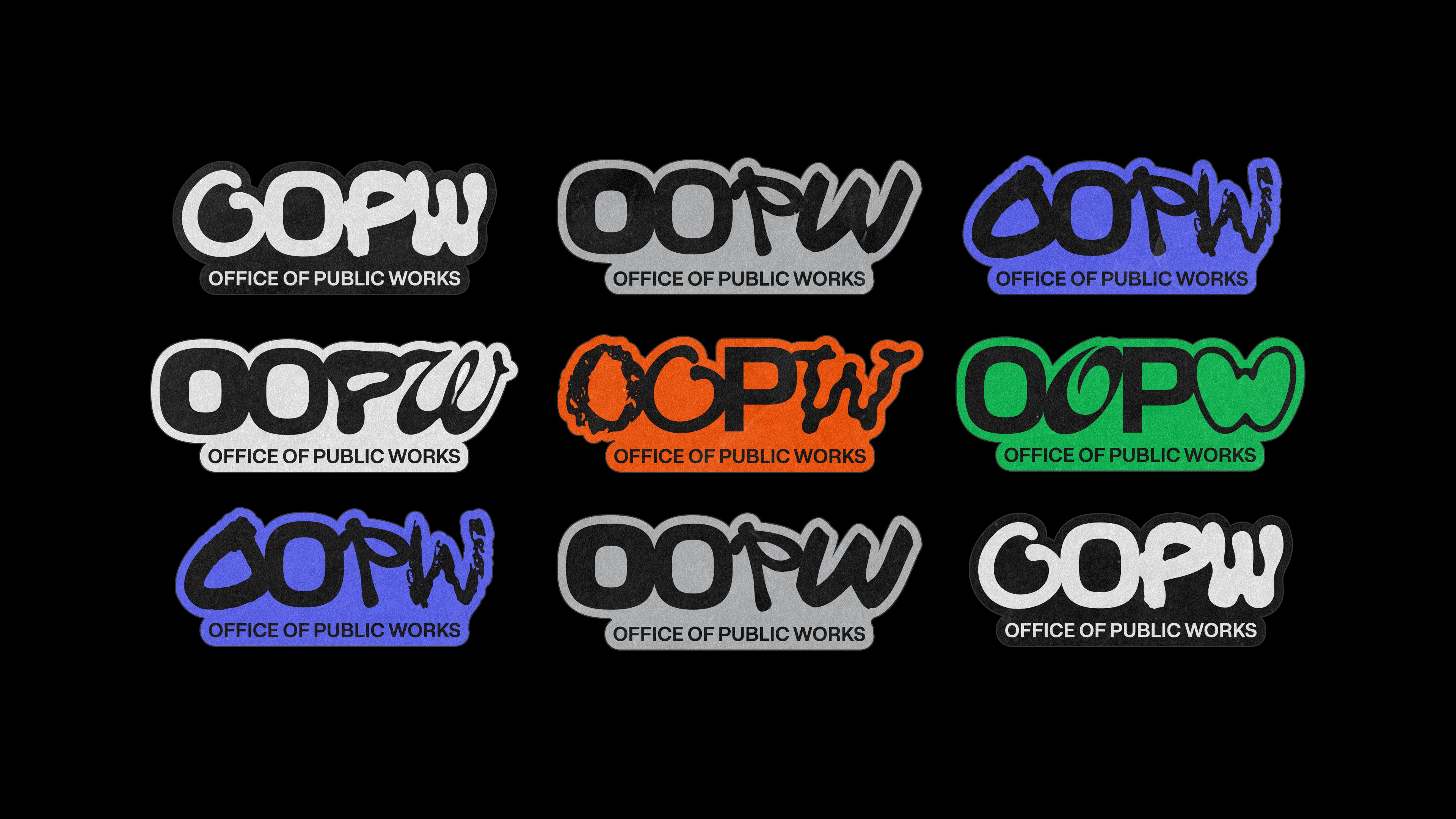
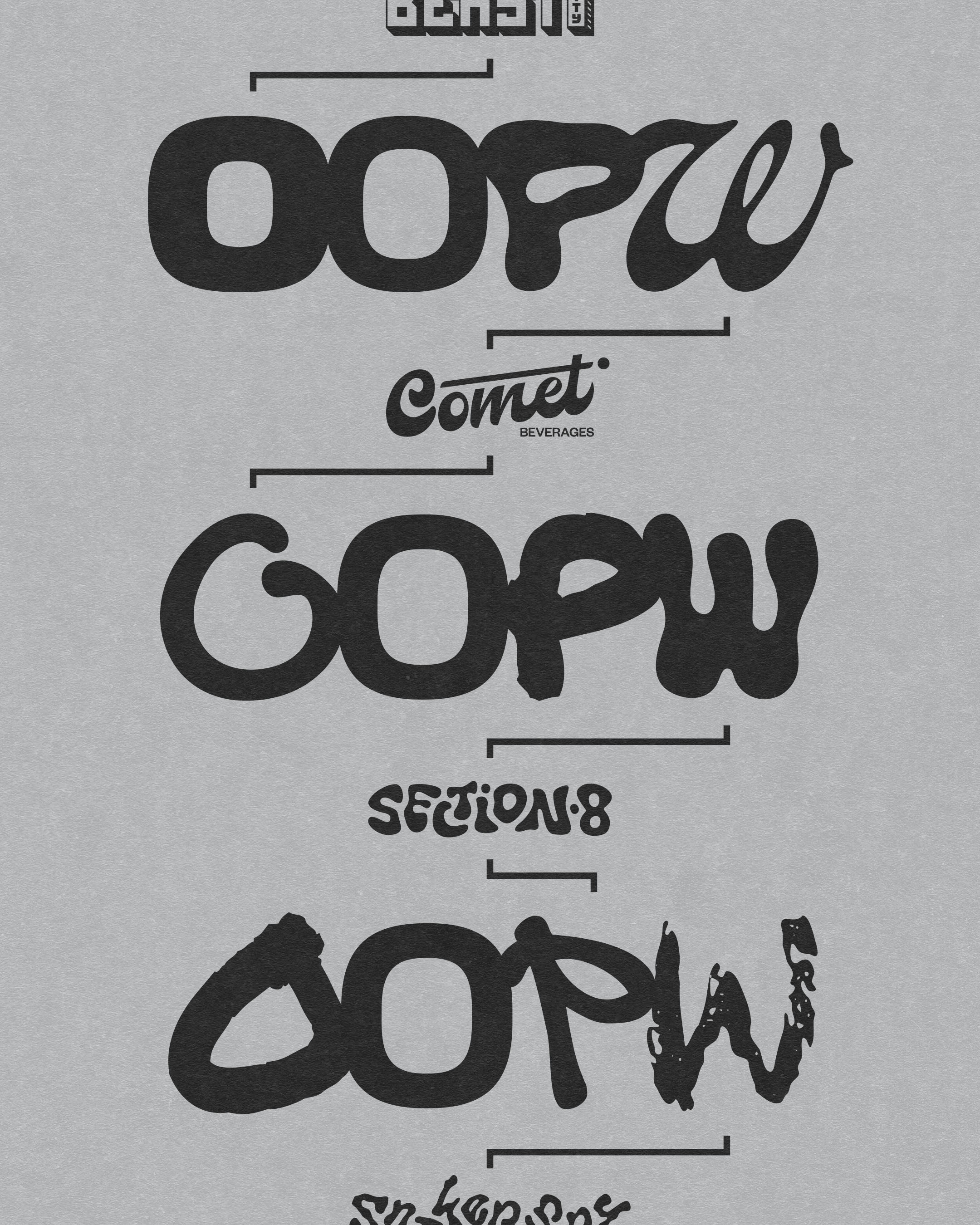
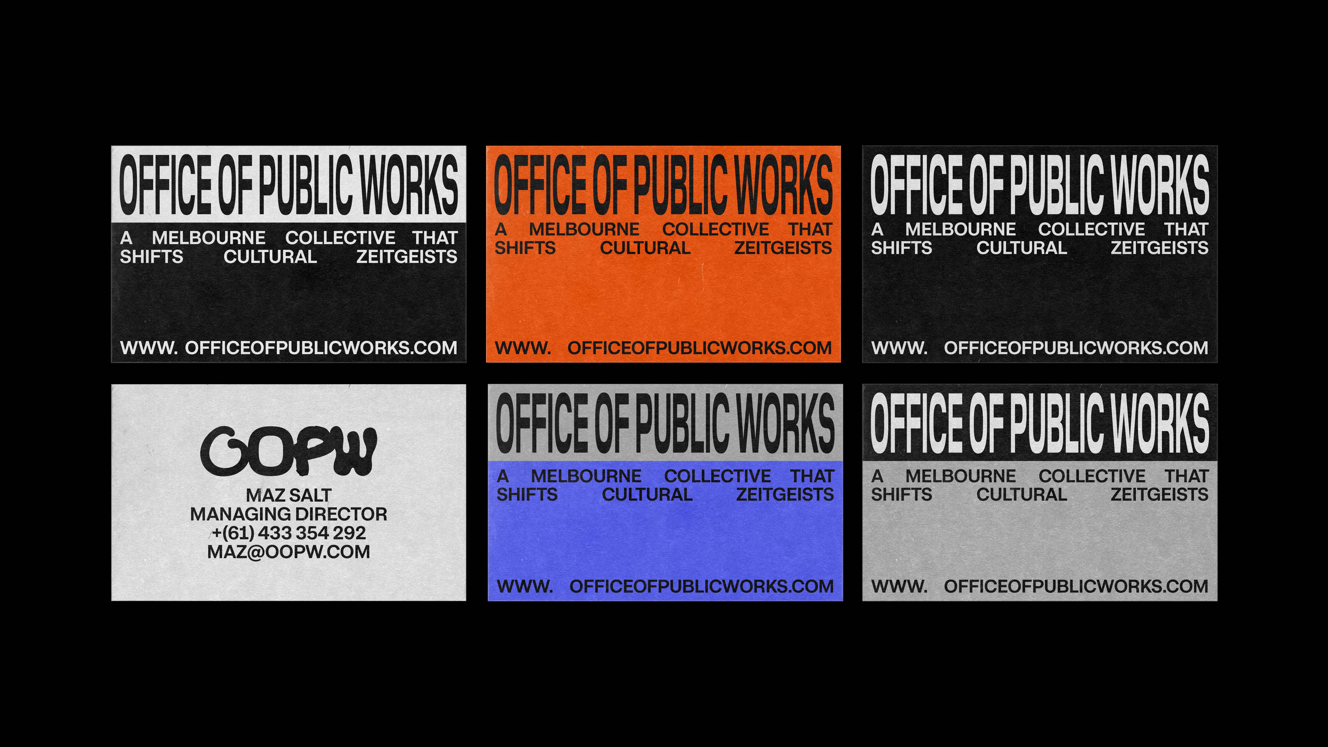
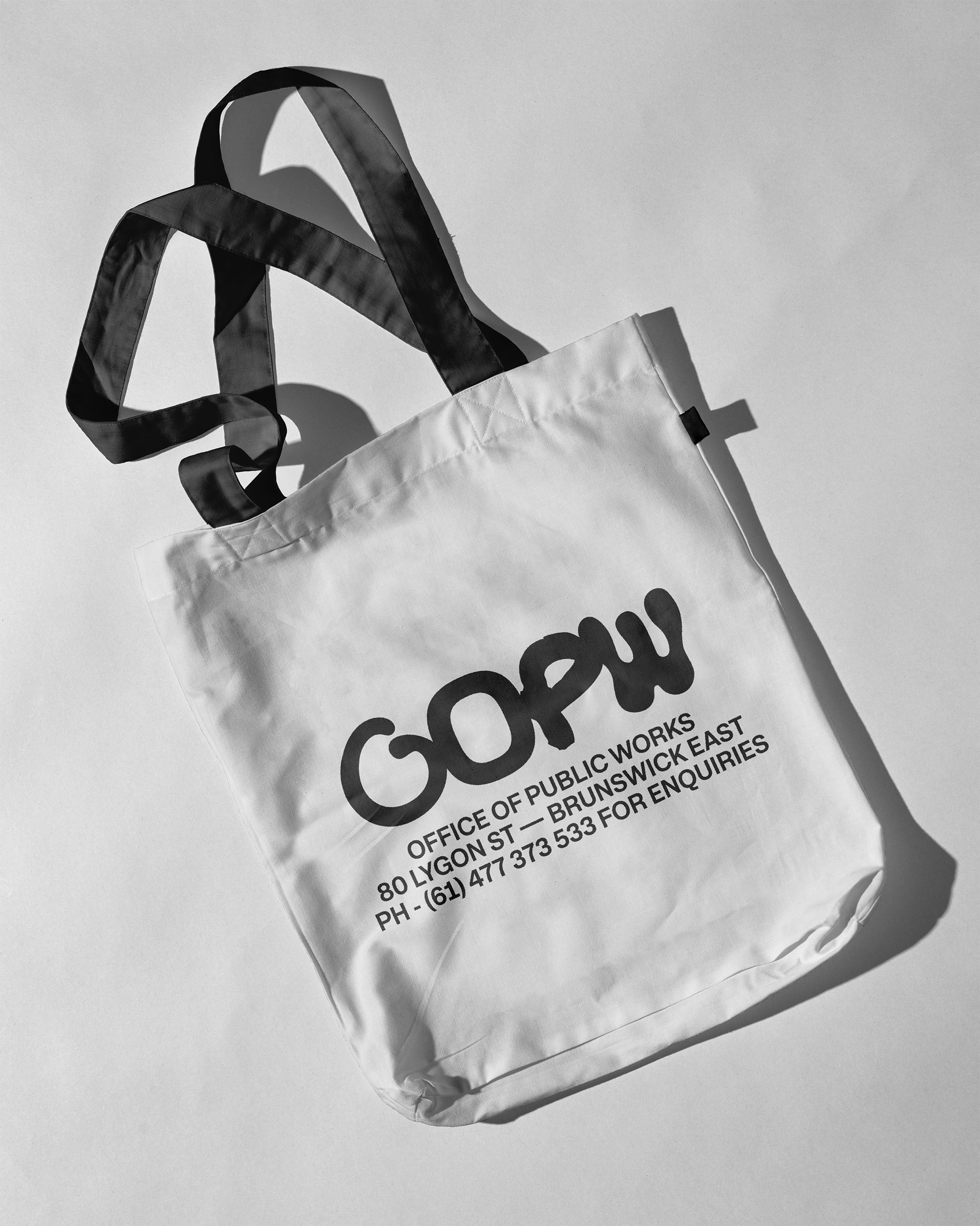
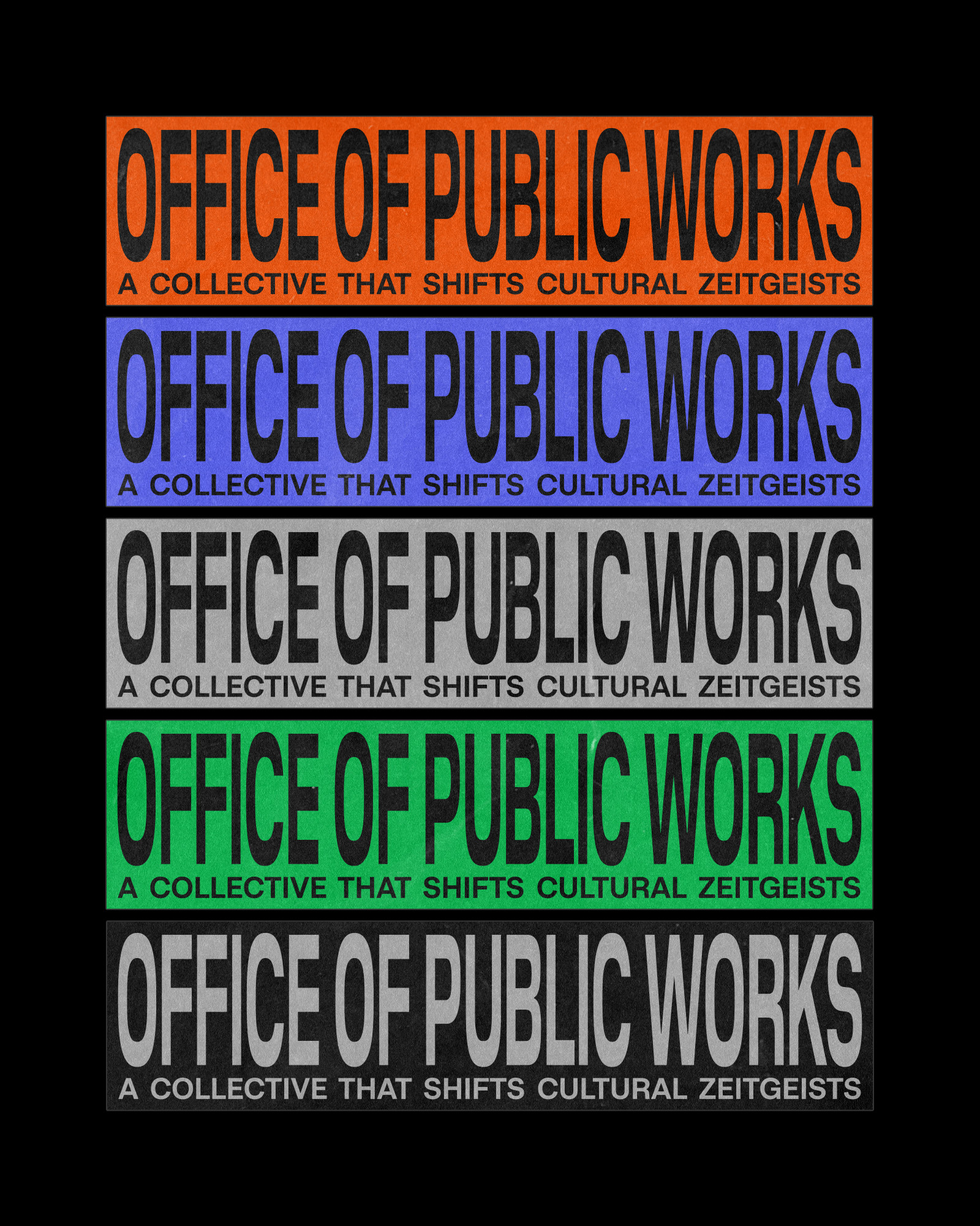
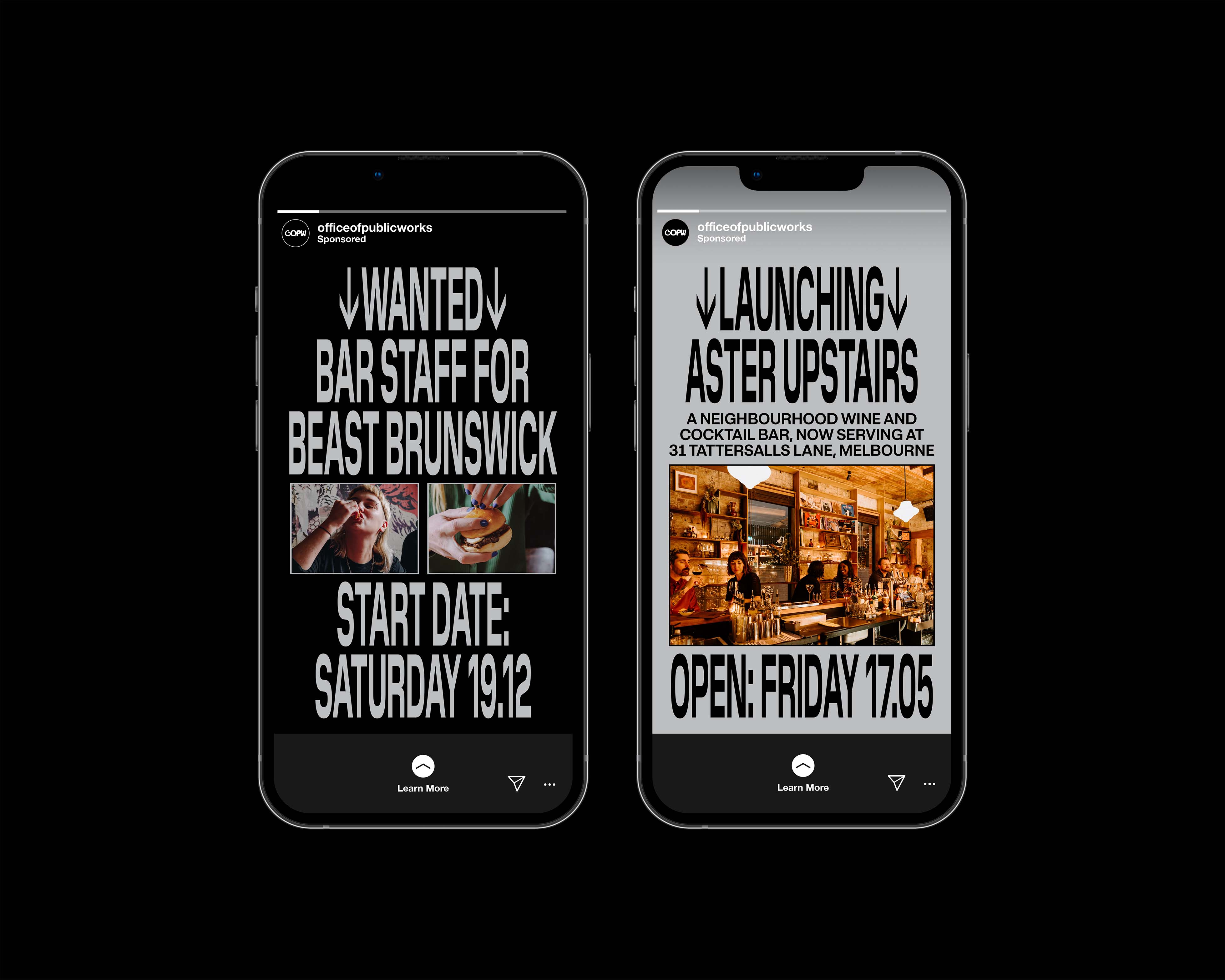
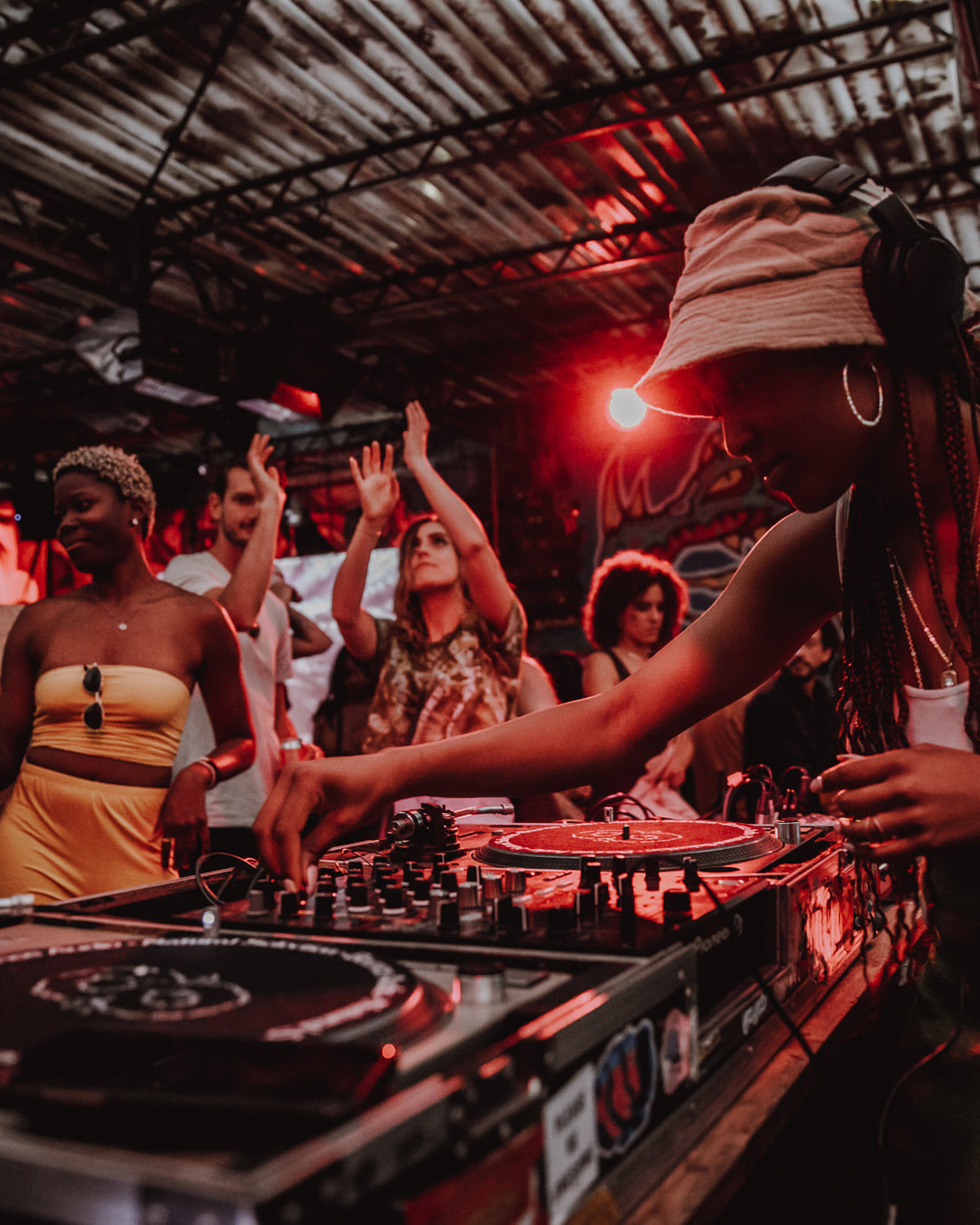
An identity designed to reflect the group's non-conformist and diverse DNA, while positioning it to achieve its practical growth, engagement and financial objectives. The group's name originally came as a wink (or leer) to a public service government department. Playing to this and the low-fi nature of the group's projects was a type language lifted from public service street signage. Cultural works currently being conducted. This spawned a wordmark logo designed to be bold, authoritative and non-conformist, with type that stretches beyond conventional best practice. Likewise, the identity also featured an organic and expressive approach to the secondary marks, namely a collection that each took typographic cues from the projects, represented sub-cultures and the grounds they occupied. Colour pairing was tight but intentional, a nod to the group's nightlife focus and often hectic energy felt within the walls. Big thanks to the team for the opportunity here ✌️
CHALLENGE
APPROACH
Credits:
Maz Salt (Founder), Melissa Tan (Marketing Manager) plus the full team across the group. Duncographic too for the photography.