Identity design for a Melbourne wine bar in a heritage-listed loft space
CATEGORY:
AGENCY:
YEAR:
2024
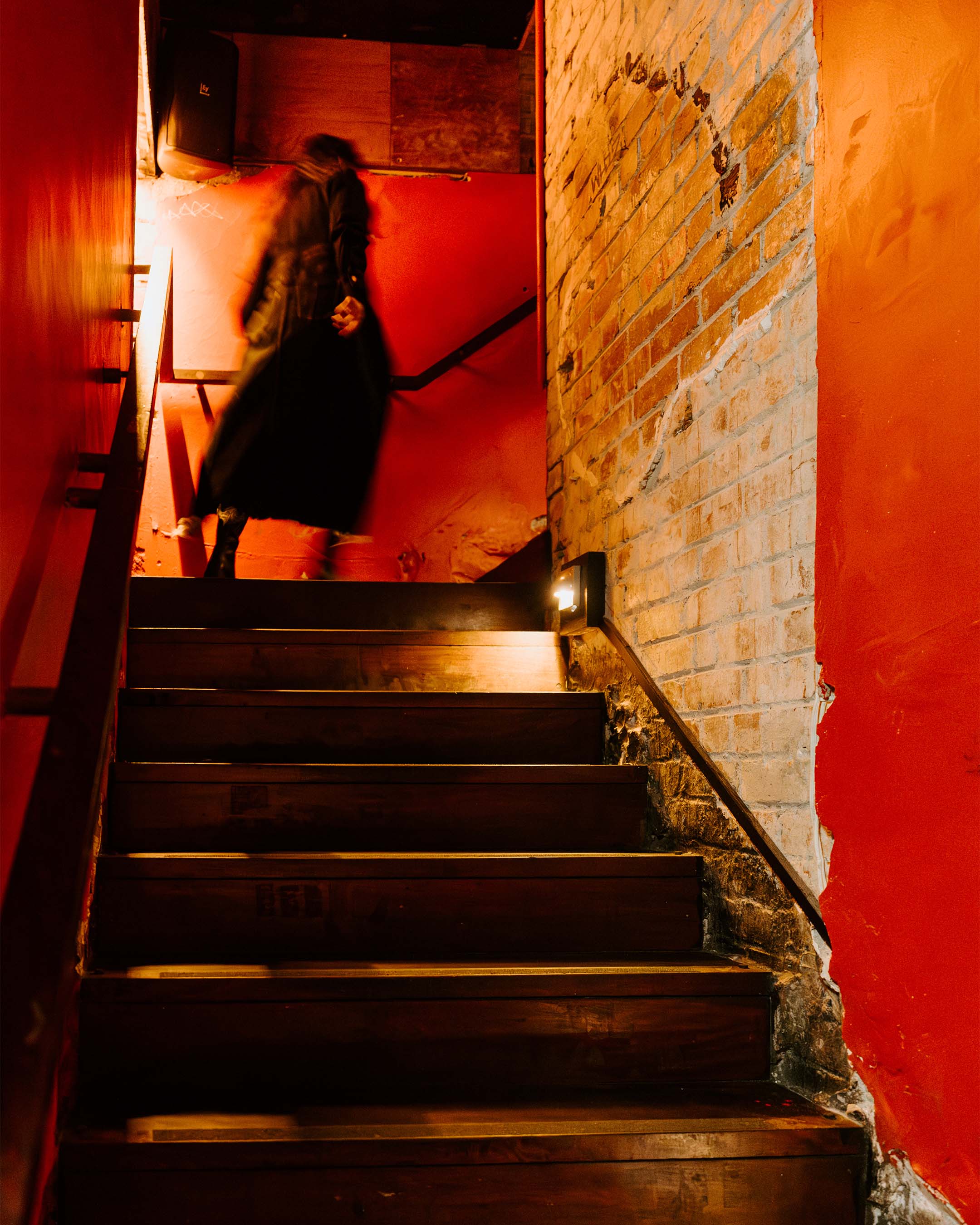
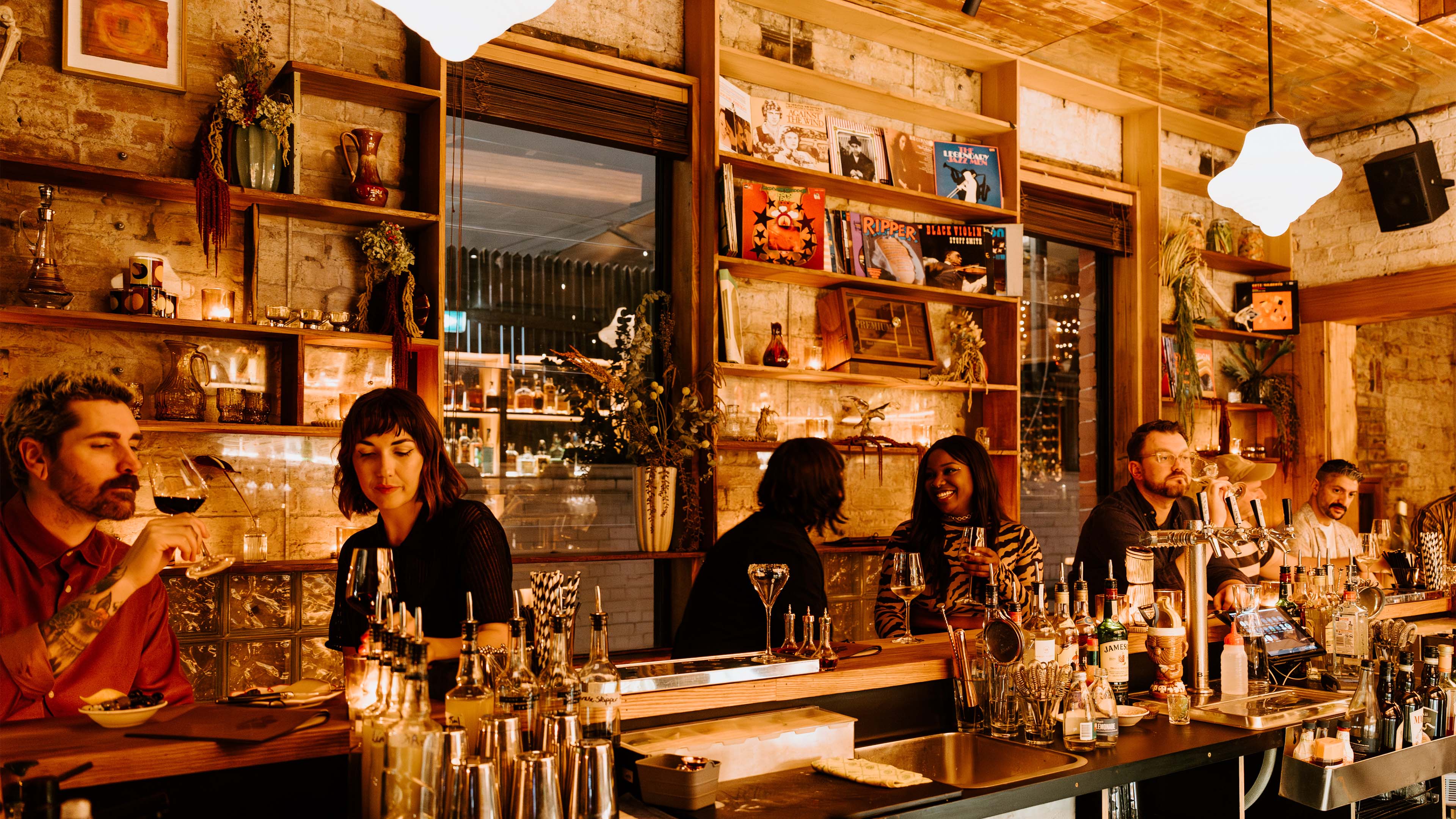
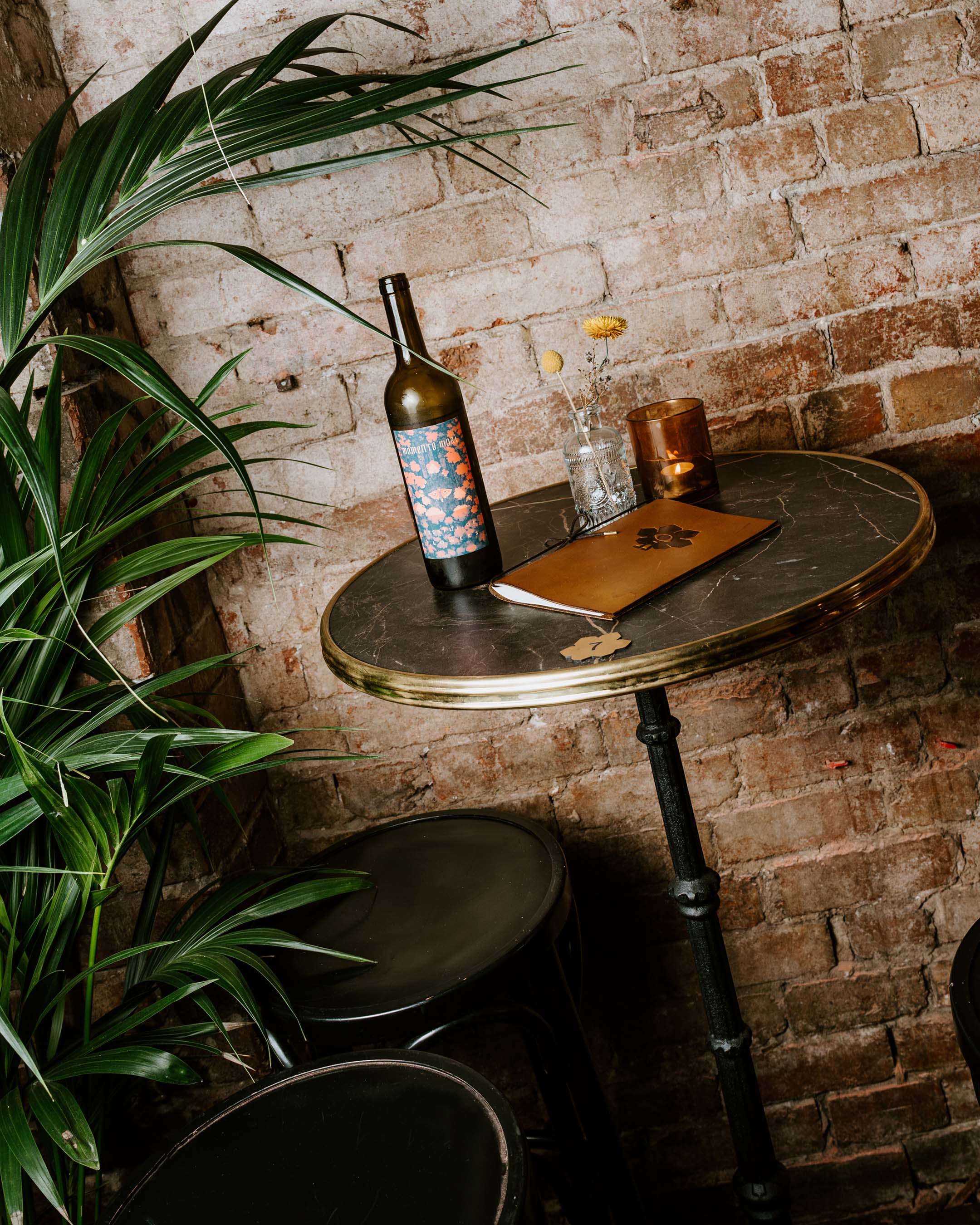
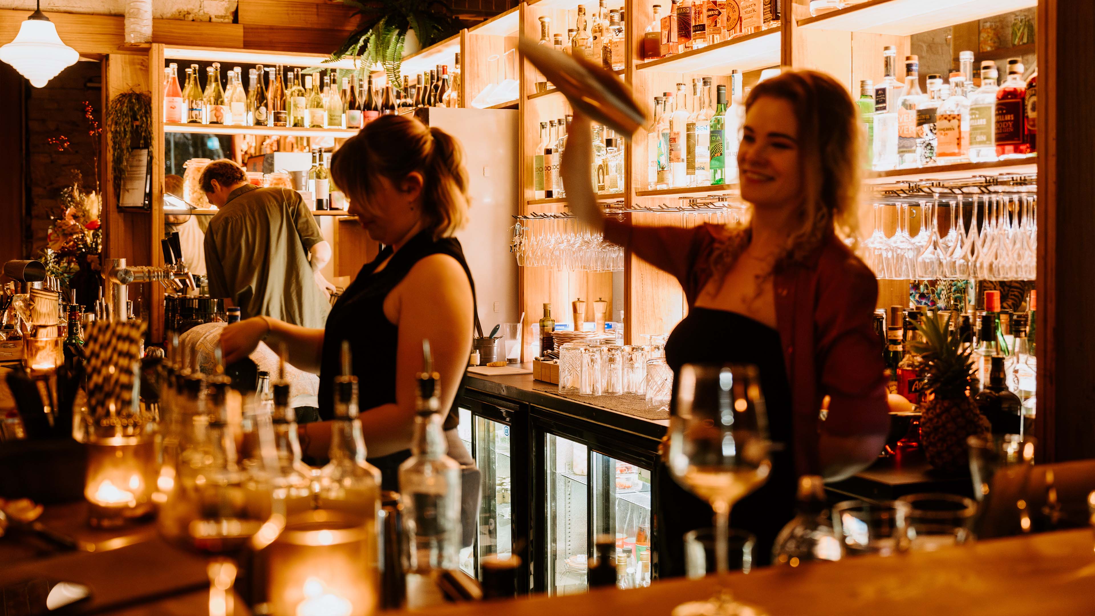
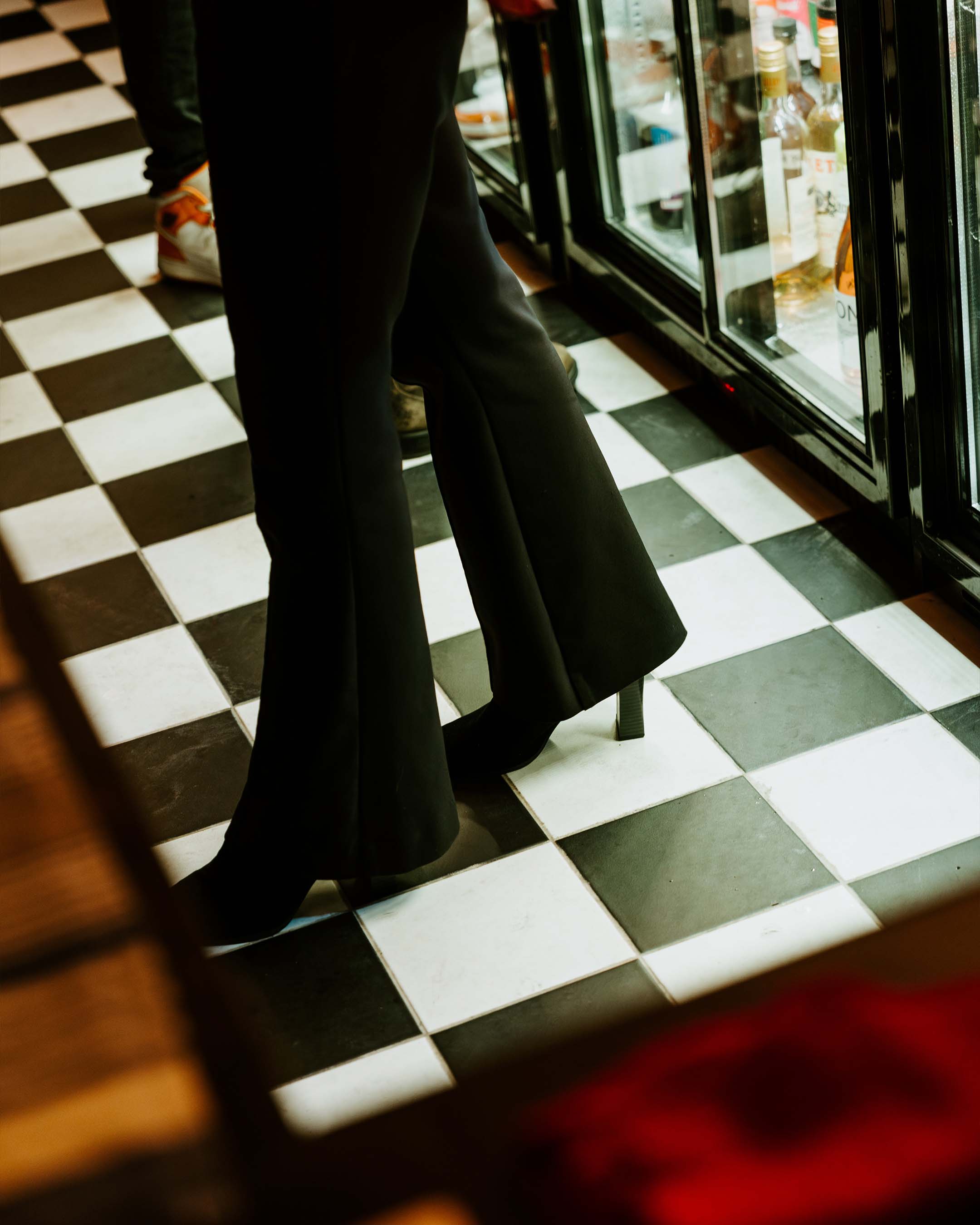
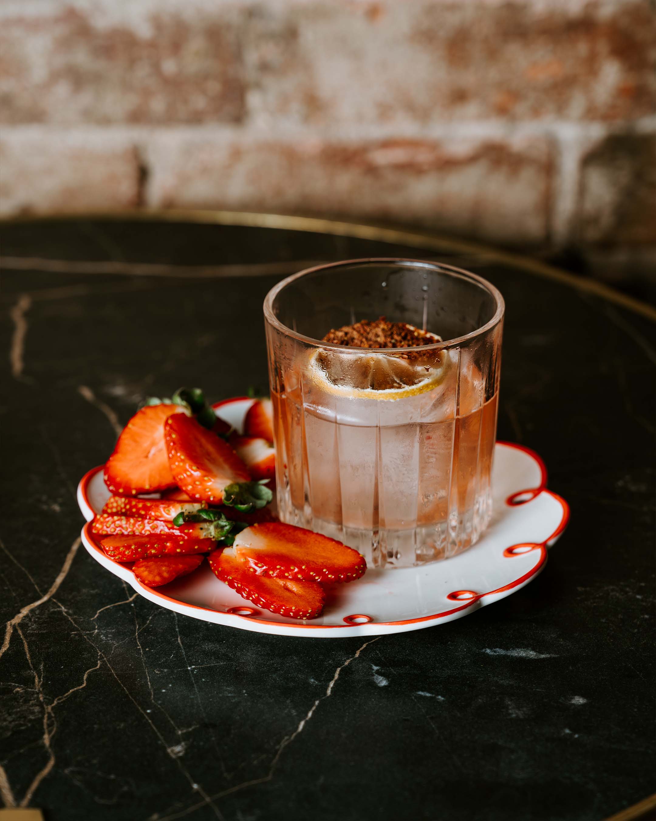
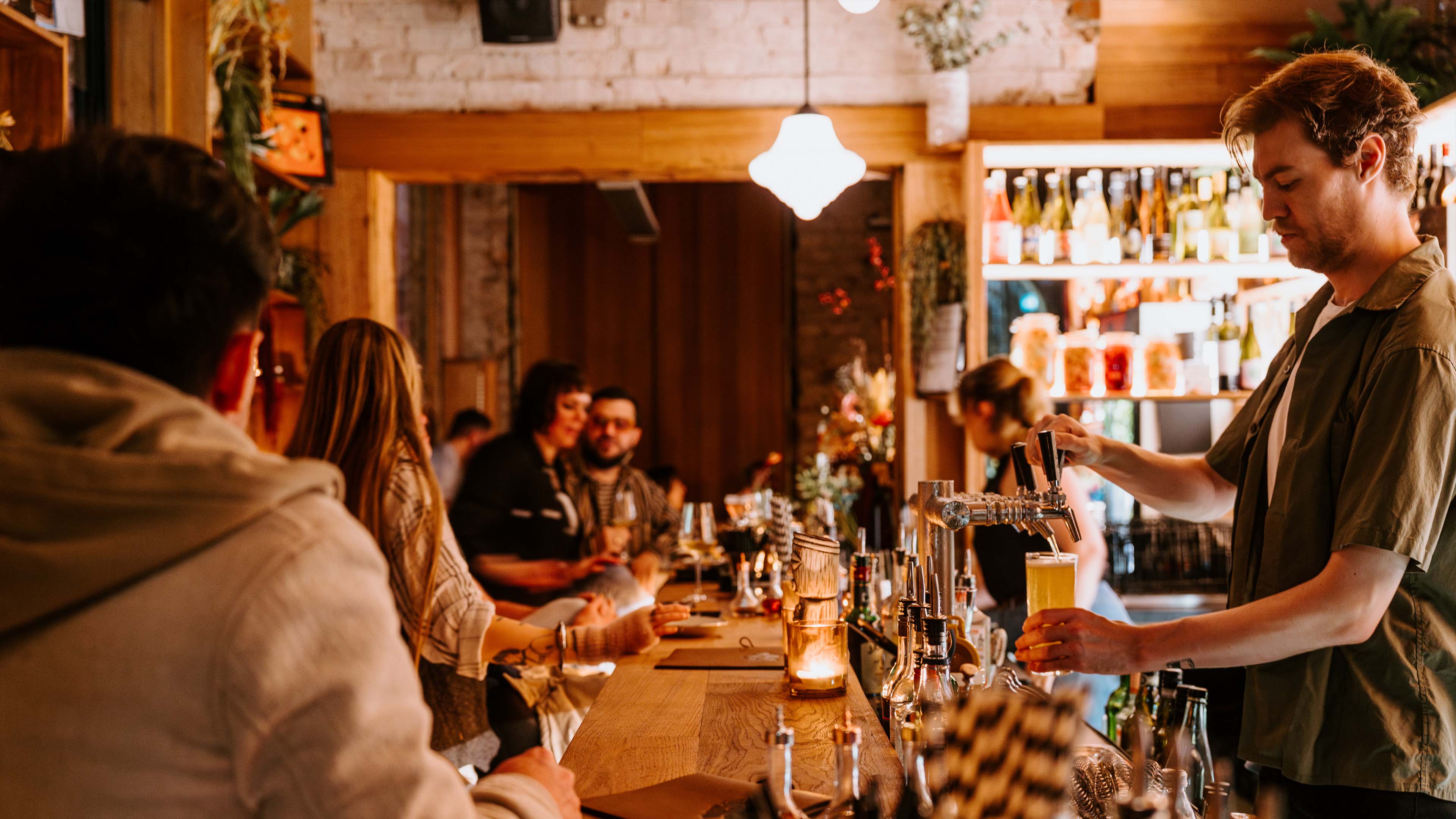
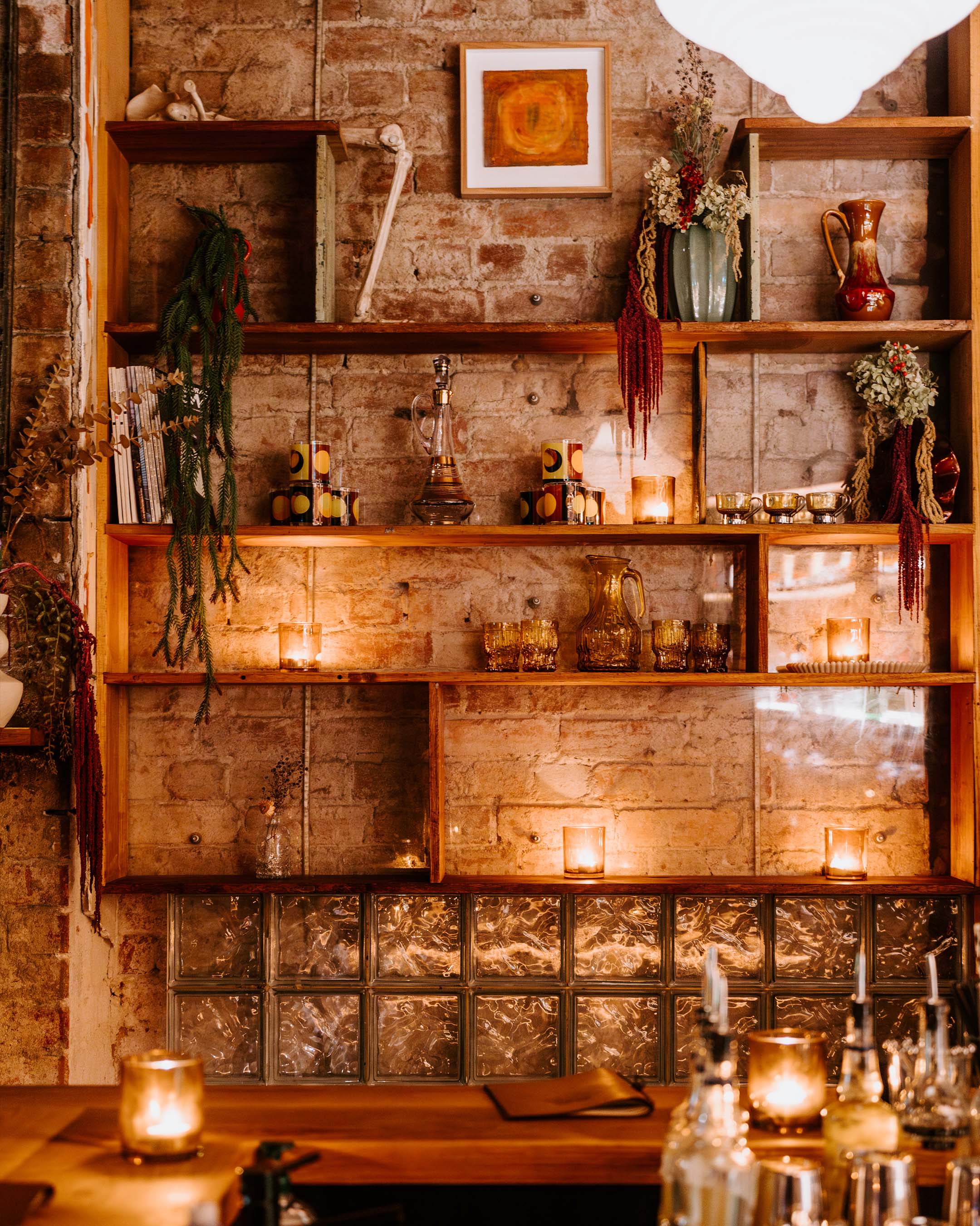
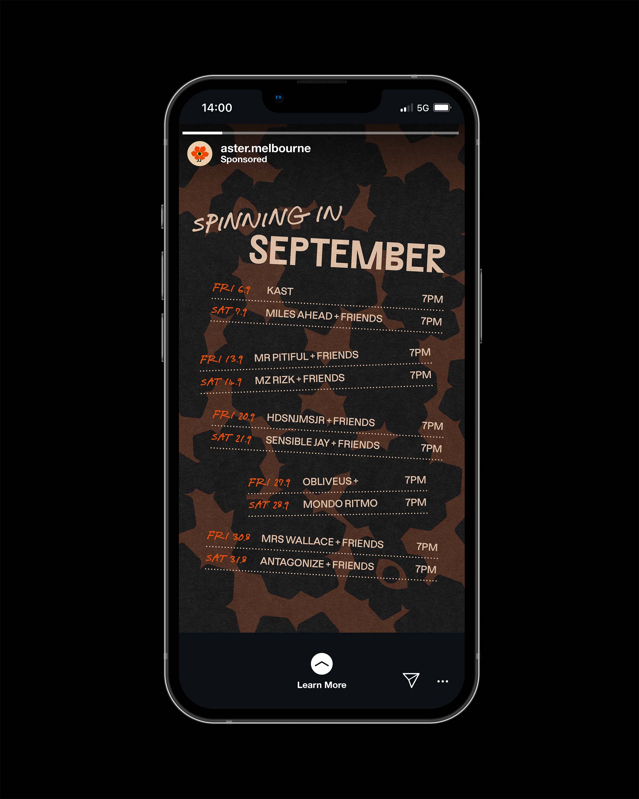
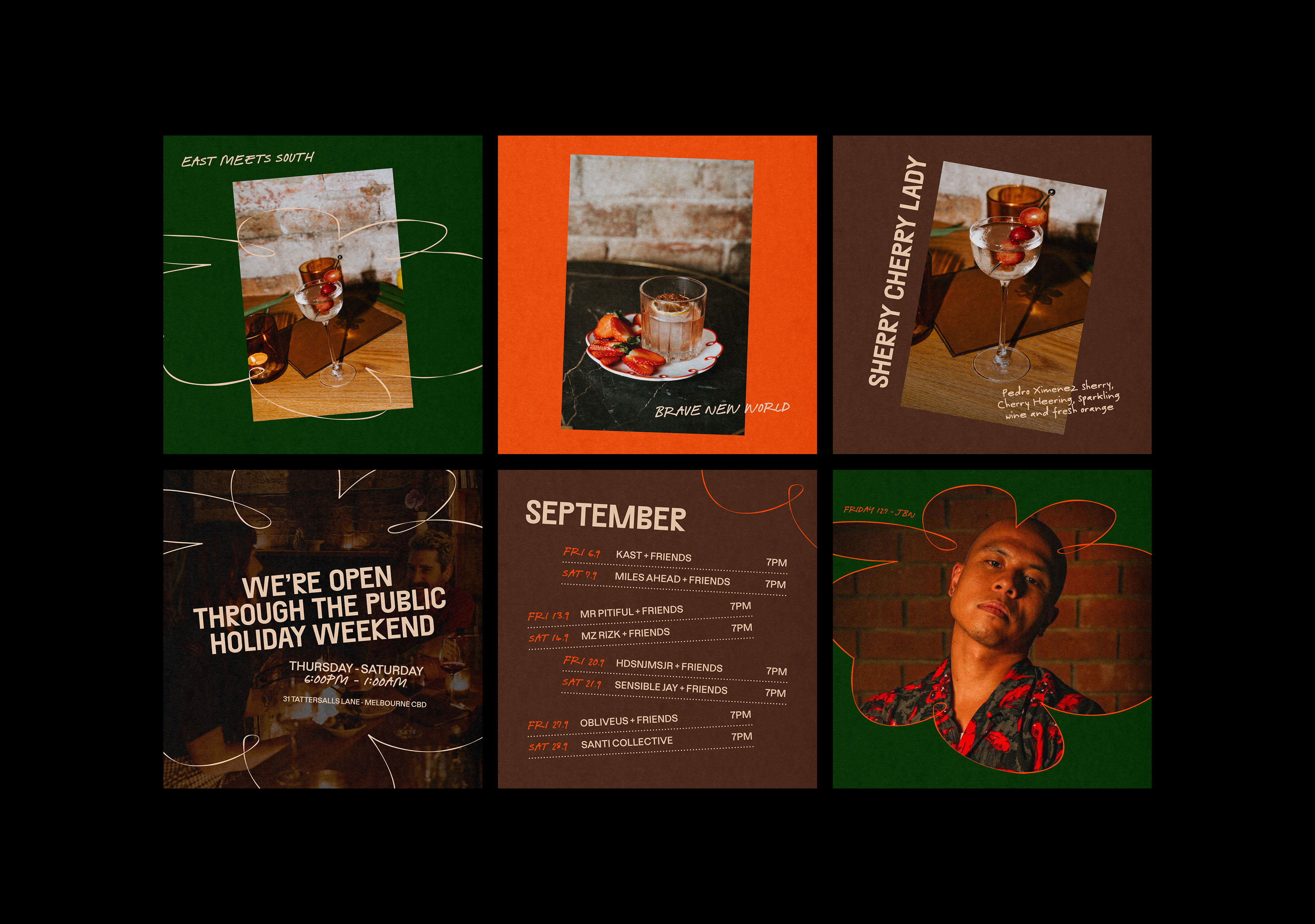
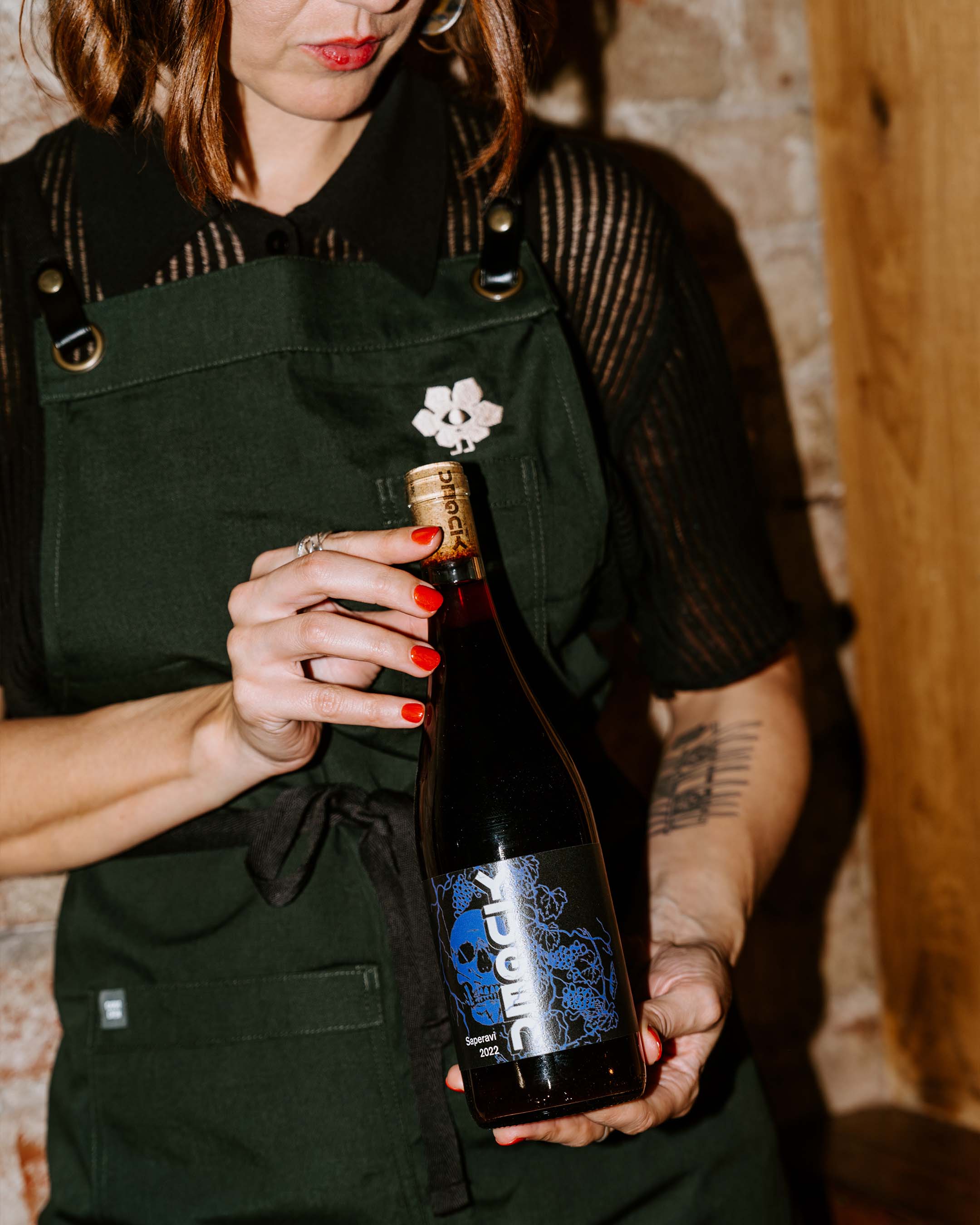
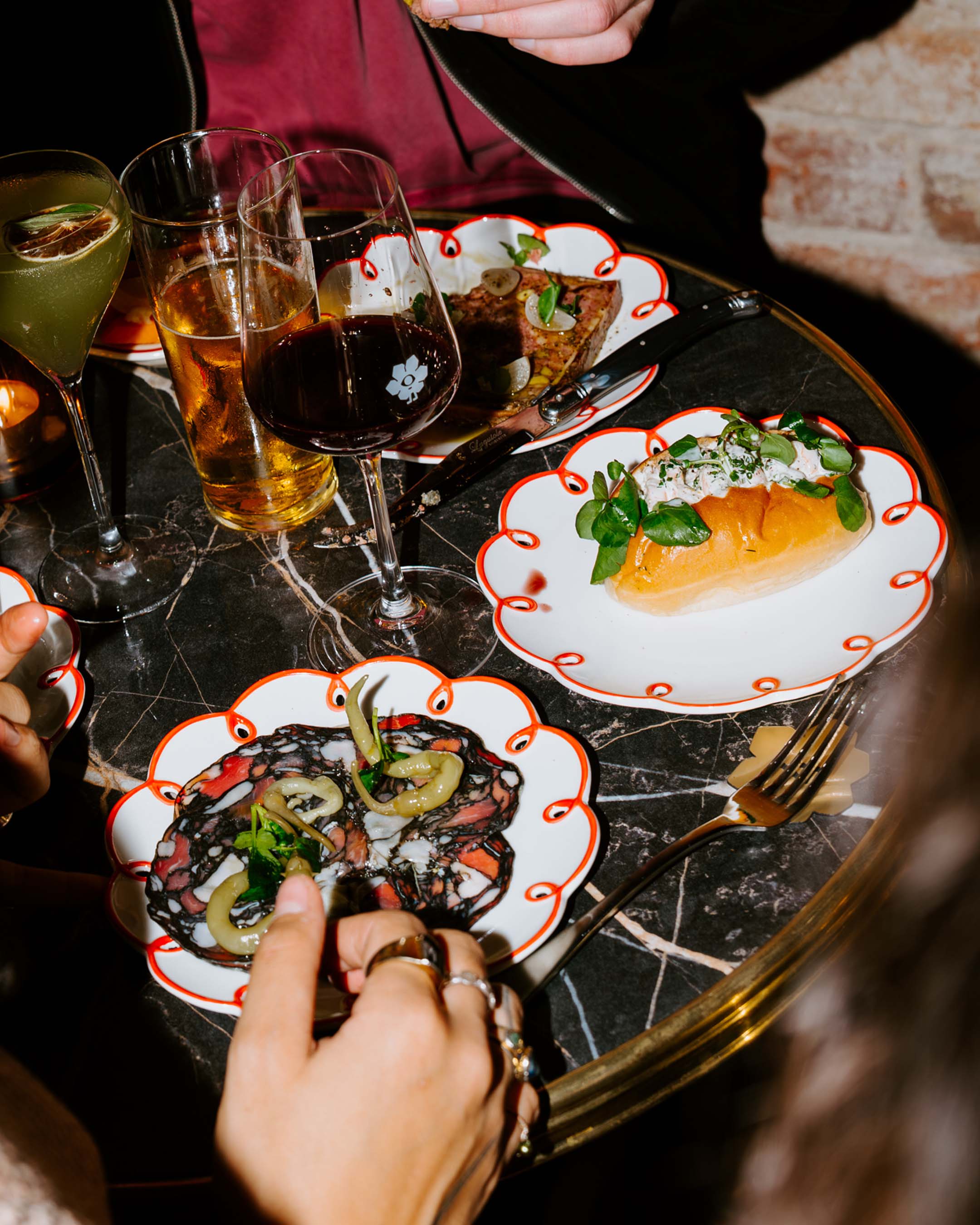
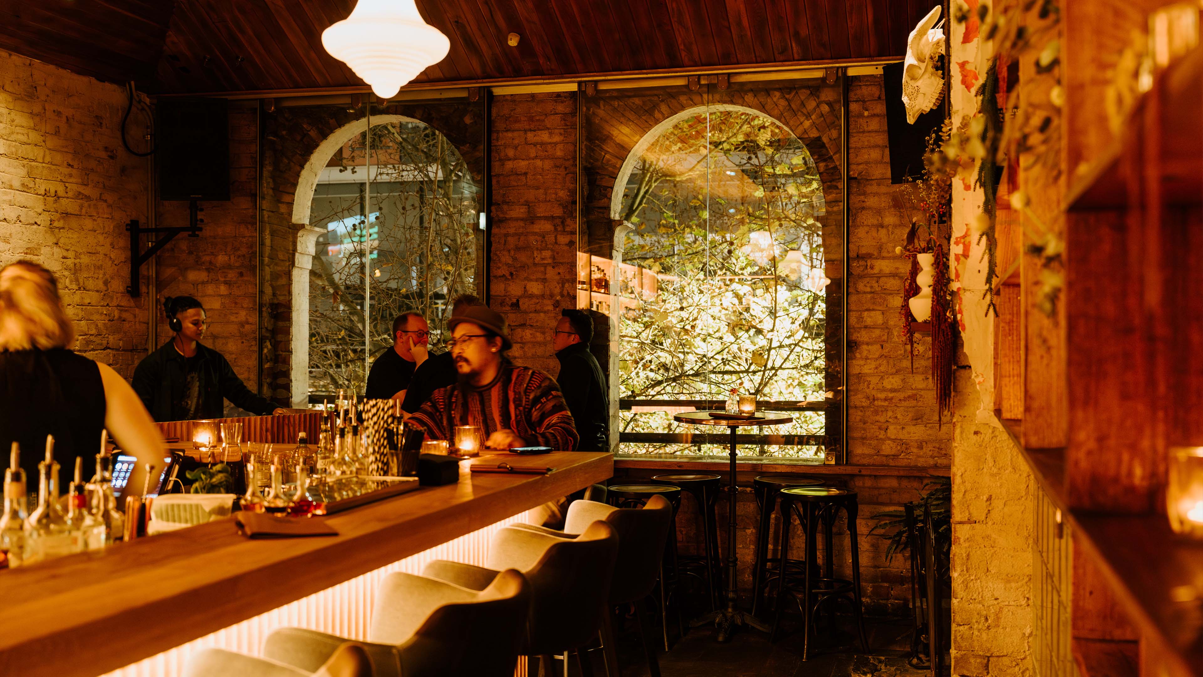
In early 2024, Ferdydurke, a late-night Melbourne fixture on Tattersalls Lane, was coming up on 12 years in the game and was due for a spruce. Long-time collaborators the Office of Public Works group had a new vision; a neighbourhood wine and cocktail bar to take over the heritage-listed loft space. Think serious date-night vibes, done with playful spirit and made for intimate hangs. A rotating list of classic and modern wines with a focus on local producers. Australian botanical plants and vintage nic-nacs adorning the space. Jazzy house to northern soul spinning on the decks. Seasonal grazing plates from saison black truffle to smoked tomato and goat's cheese. Cue a chef's kiss hand gesture. The new concept needed a brand direction and identity to embody this vision, the energy of the space and the personality (plus personalities) behind the offering.
CHALLENGE
APPROACH
No items found.
No items found.
Outcome
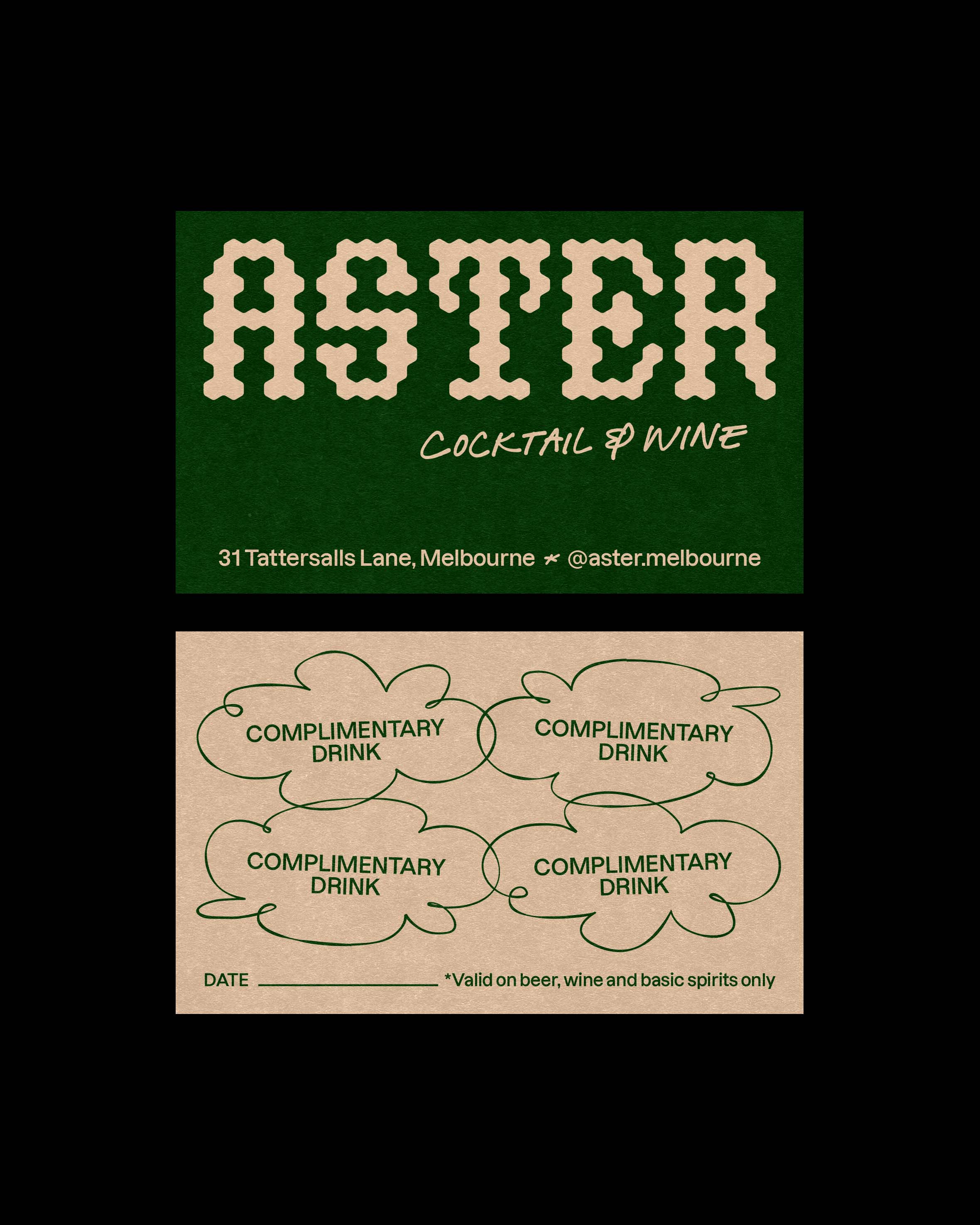
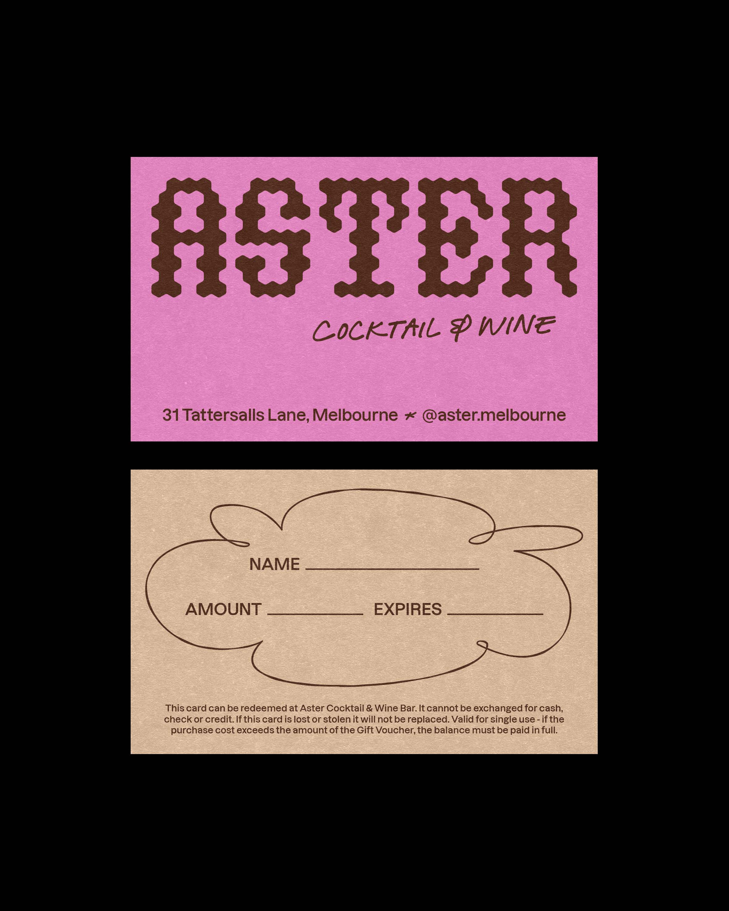
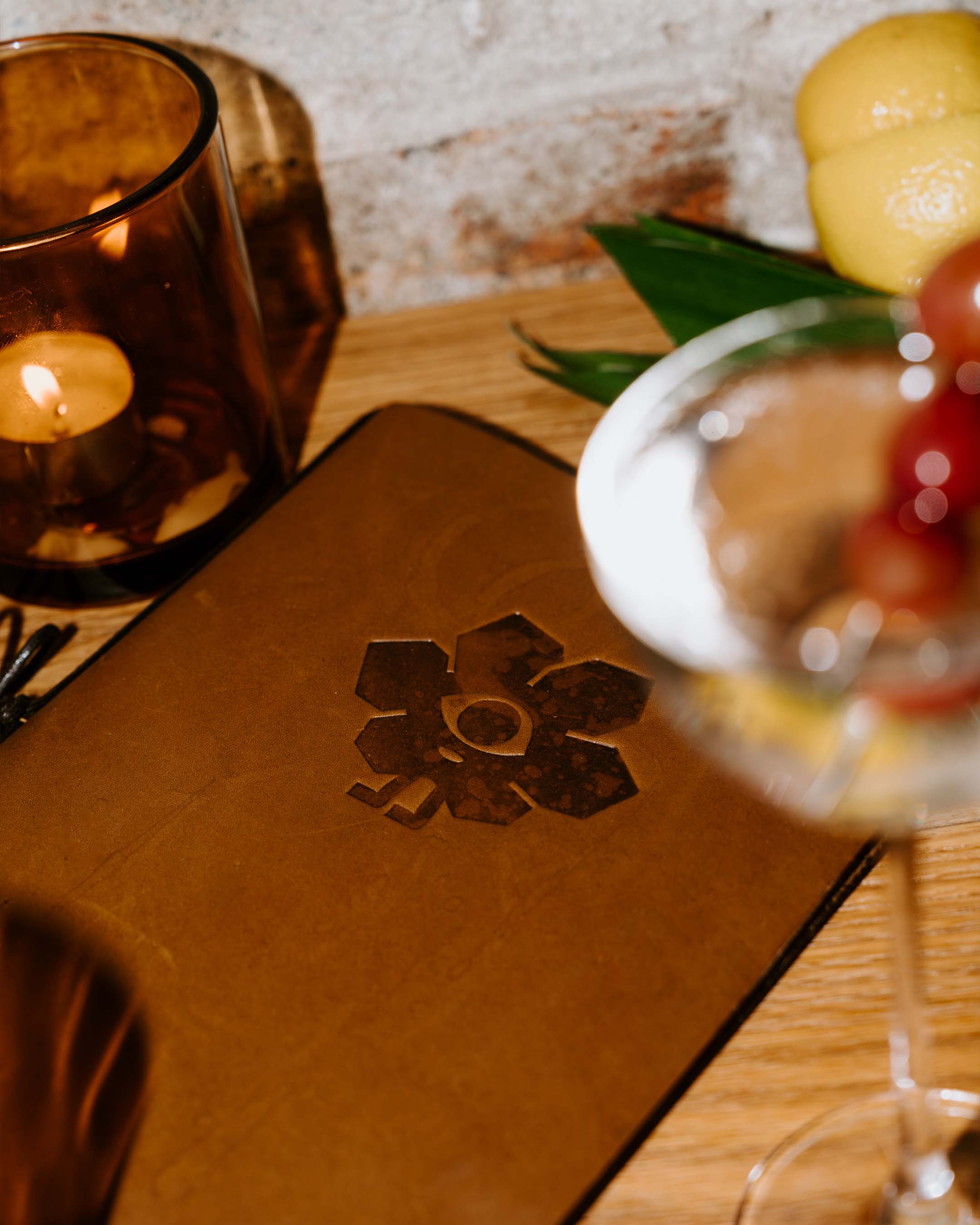
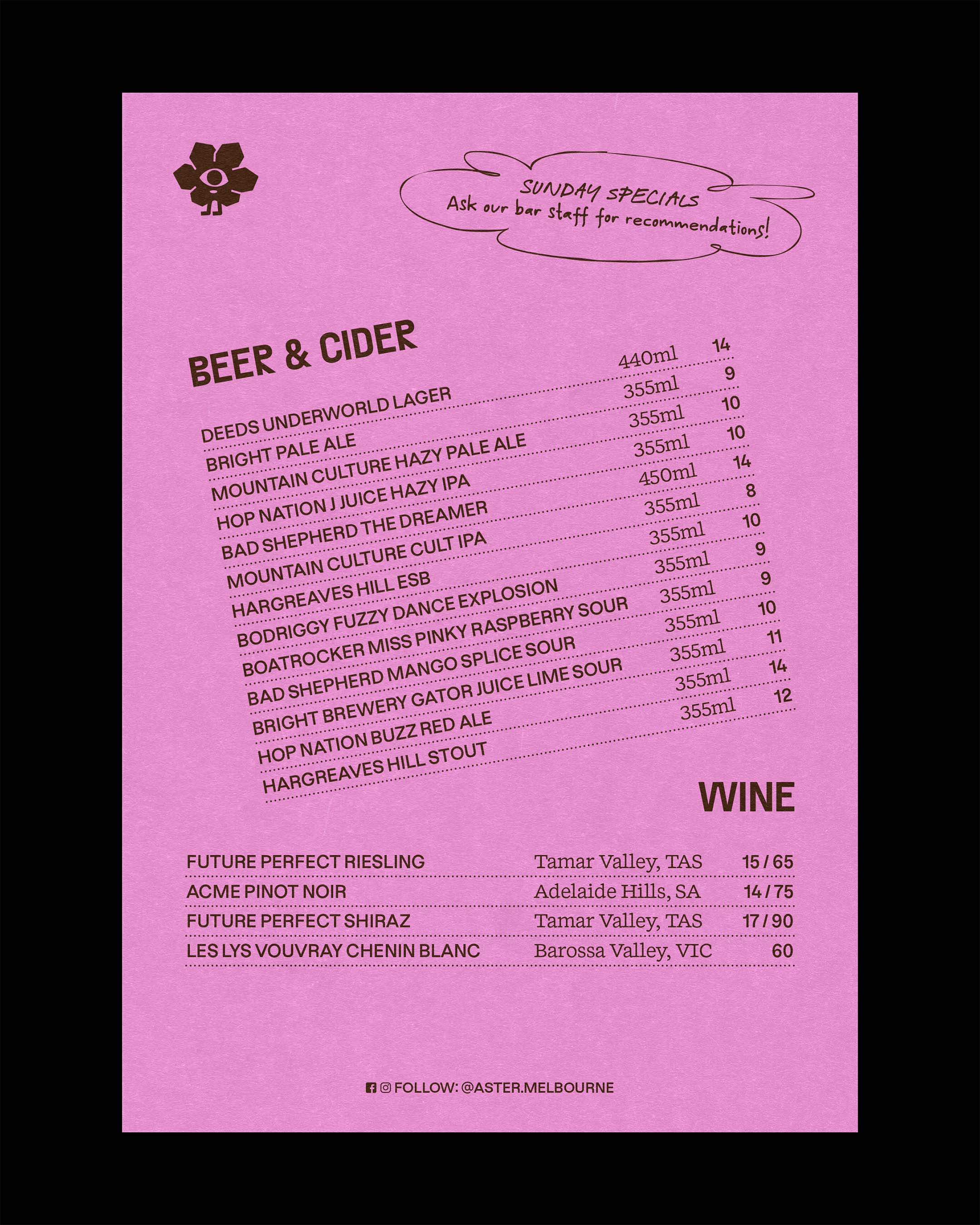
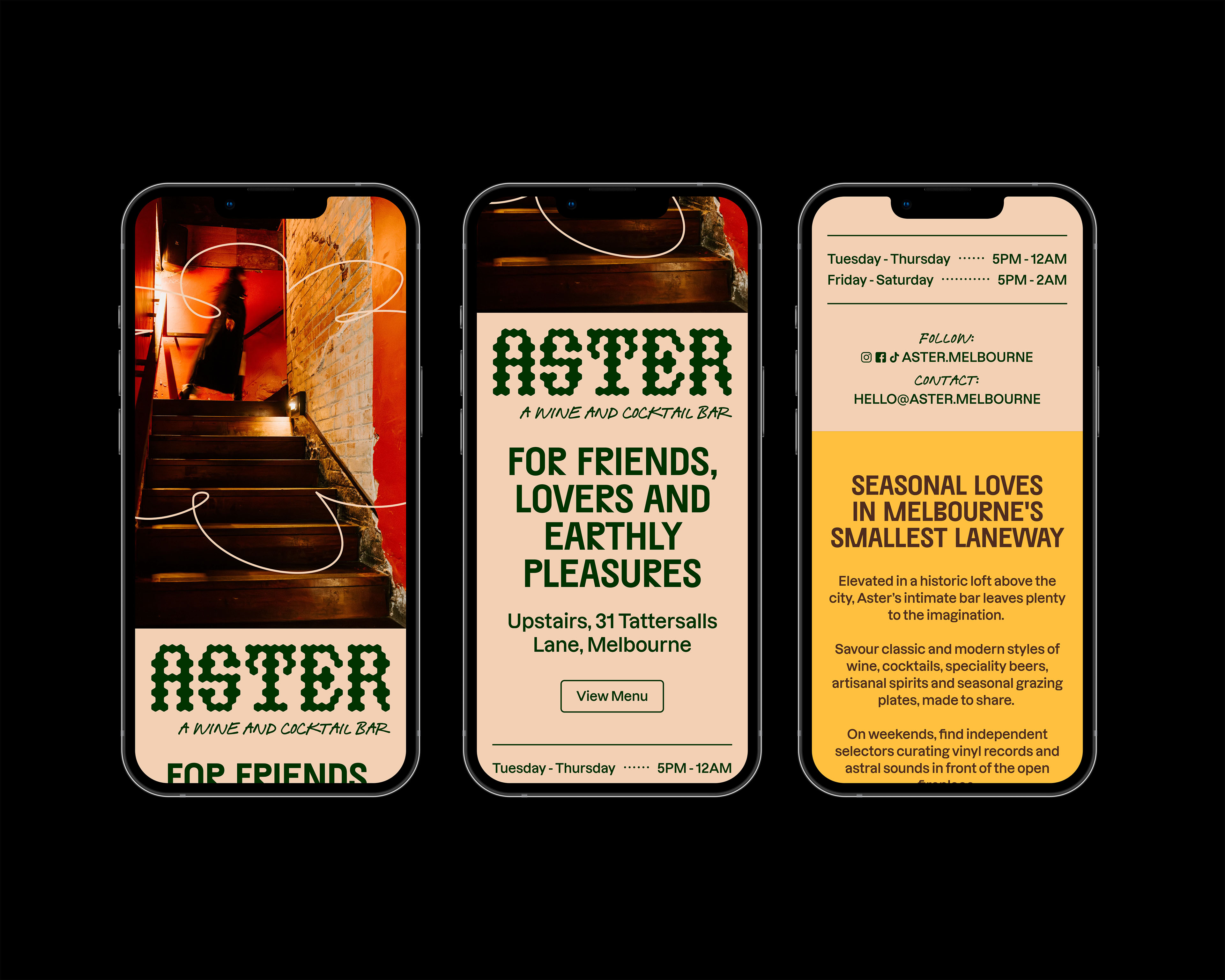
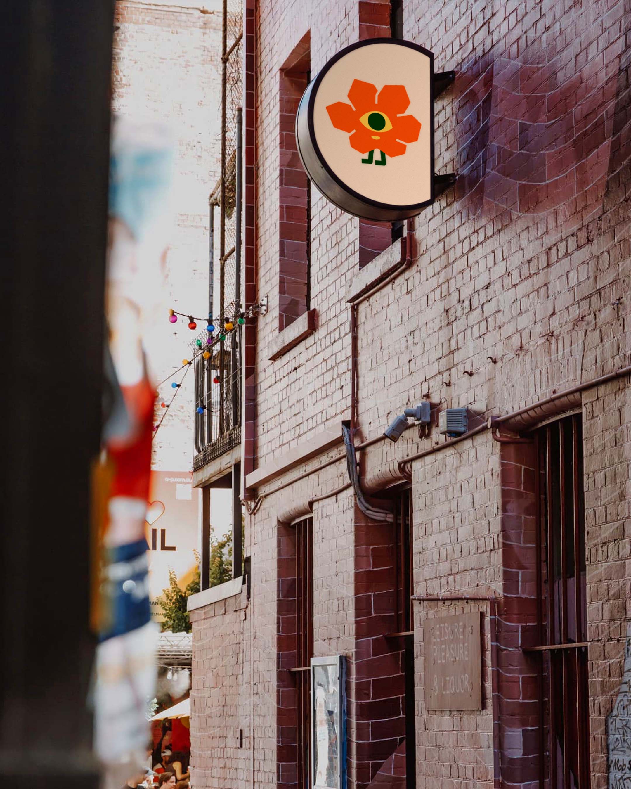
We worked with the team throughout the build and launch, developing the concept's identity across exterior signage, interior fit-out, menus, music program materials and more. The identity looked to channel the vision's confidently upmarket, but welcoming neighbourhood feel, while offering a playful, organic and contemporary interpretation of the venue's namesake. This direction was led by an expressive wordmark logo. Tall letterforms nodded to the height of the loft and shape of the building's iconic window arches. Each letter given abstract floral treatment, taking cues from flower-laden letter wreaths. Paired with this was a bespoke character mark, designed to embody the name and the same warm, playful and inviting energy of the space itself. The identity's colour palette took inspiration from the tints and tones of the heritage-listed building, the contemporary vintage interior design direction, and the bright pops of colour common to the common Aster flower. A tasty mix of earthy browns and greens, paired with vibrant pinks and reds, all making for a flexible brand colour system. An incredible project to be a part of, with special thanks to the team at Aster and the Office of Public Works group for getting us across this one.